PINK POP! - New Surface Pattern Design Collection - Part One
Posted on
Back in August Make It In Design launched their membership programme - The Colour Gang, which I signed up to straight away and I'm so glad I did. With regular briefs, colour palettes and all the knowledge and insight from inside the Surface Pattern Design industry I've never had so many ideas or so much inspiration to work with!
Since I joined The Colour Gang I've created lots of patterns, 34 is the number so far I think, and I'll be uploading those to Fashion Formula during the week and hopefully they'll be for sale in my Studios storefront on there with the next couple of weeks - I have to order and check samples first, there's nothing quite like seeing your work on actual, real pieces of fabric, I don't think I'll ever get tired of that!
So here's part of one of the new Pink Pop! Collection I've designed, this one is actually my largest ever collection with 10 designs in it, so I've split it into two for blogging purposes.
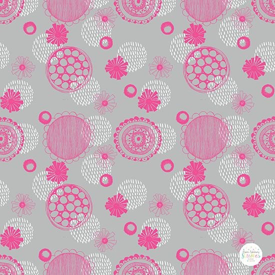
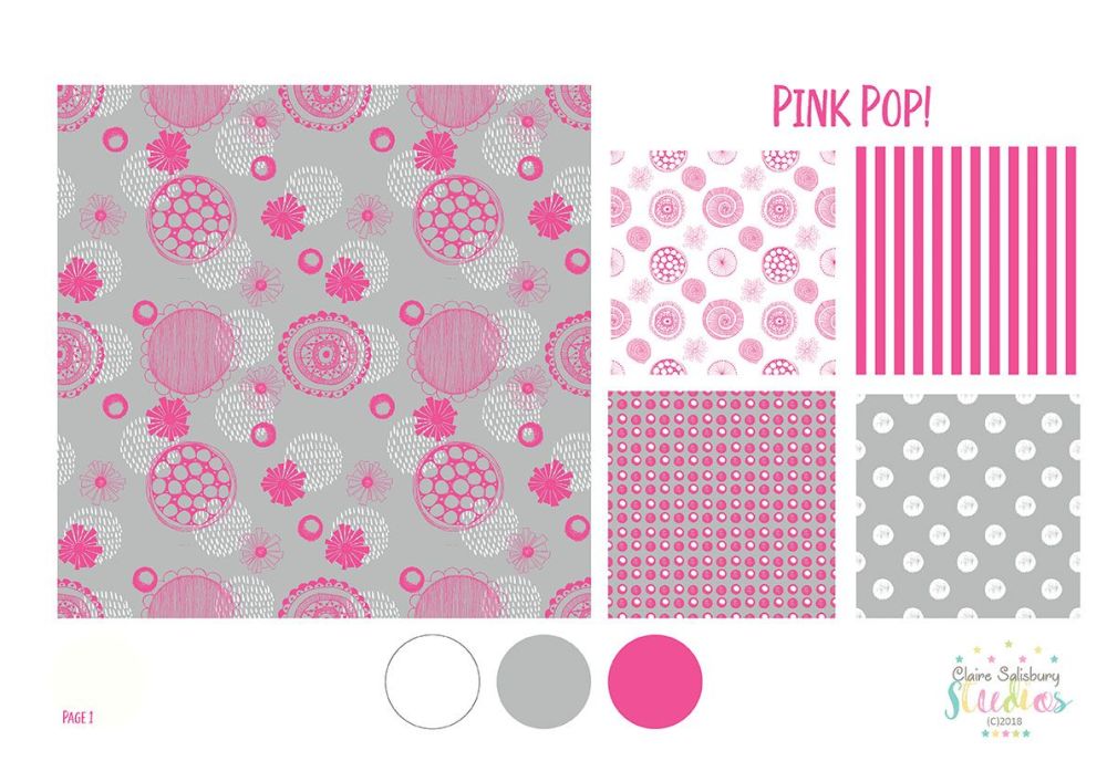
This is one of the main patterns in the collection, I decided to restrict myself to just 3 colours from the alternative Retro Palette from The Colour Gang Retro Brief and Hot Pink, White & Grey is one of those colour combinations that work really well for me.
There's some decorative circles, florals, seed head sketches and brush pen marks used in this one. I do have a thing for layering and texture when it comes to patterns and that's another reason I chose to restrict the colour palette for this collection.
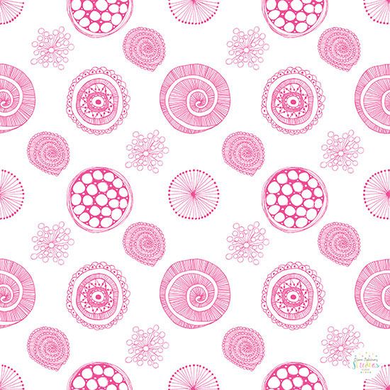
As the main pattern is so busy I wanted to turn it down a notch and simplify it a bit so I decided to use Hot Pink motifs on a plain white background. I chose some new motifs to include and used a couple of motifs from the first pattern to tie them together.
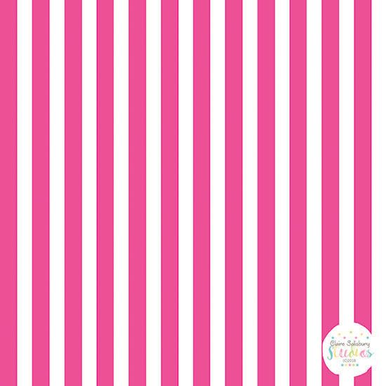
Next I wanted to make some simple co-ordinates to go in the collection. I can't actually believe I'm going to admit this publicly, but, this is the first time I've ever created a stripe pattern! Why? Why on earth have I never used stripes before? Such a simple co-ordinate that looks good in any collection. I do solemnly swear that from this day forward I will use more stripes!
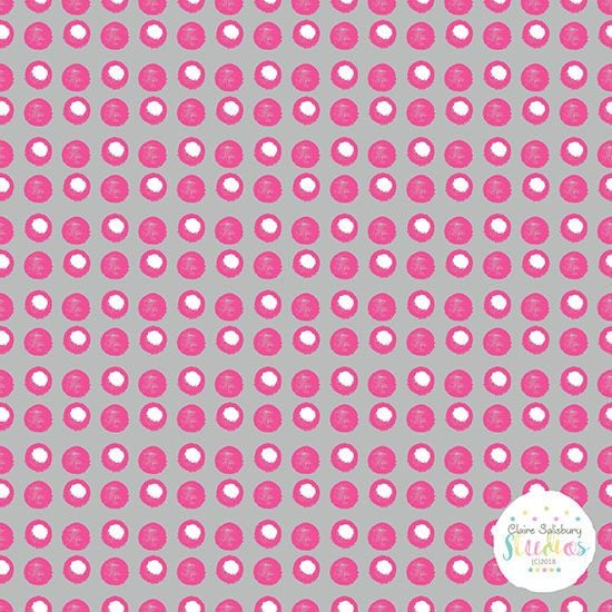
Spotty co-ordinates are also a firm favourite with me so I created a few different spotty patterns for this collection, it's surprising how many different spotty patterns you can create.
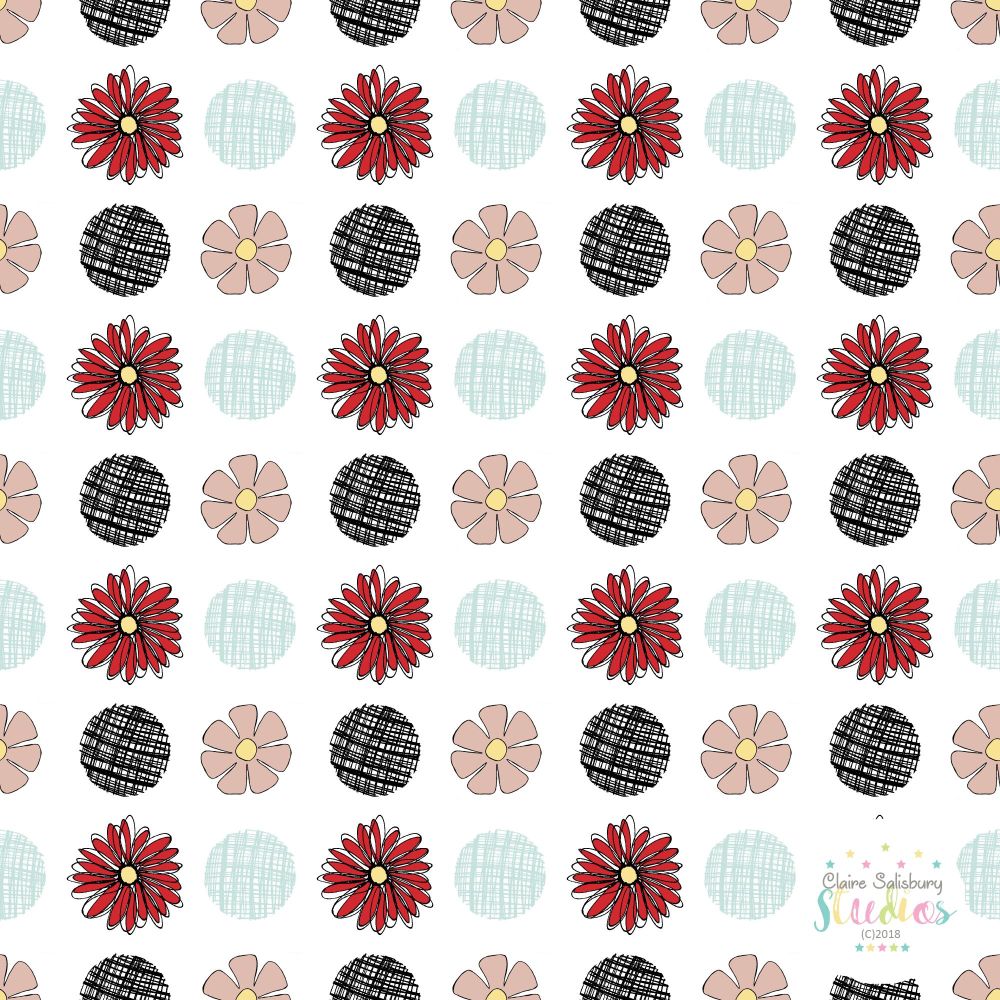
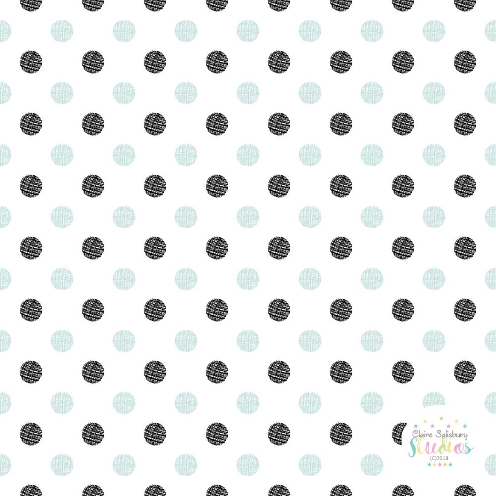
This pink & grey spotty pattern started off as a circle outline drawn with a brush pen and another circle drawn drawn & filled in with a brush pen, they add a lovely bit of texture to the pattern.
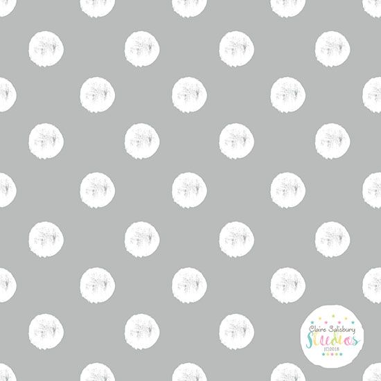
And finally this white spot on grey background is a larger and simpler version than the above pattern. I'll be ordering some extra of this one as my mum wants to use it to re-cover an Ottoman so I'll be taking photos of that project in progress.
And this is how the first 5 patterns look alongside each other on a presentation board.
I'll be back soon with the second part of the Pink Pop! Collection and progess updates on the Ottoman.
Stay colourful!
